Accordion
A vertical stack of interactive headings that each toggle the display of additional content. Used to reduce vertical space while keeping content accessible on demand.
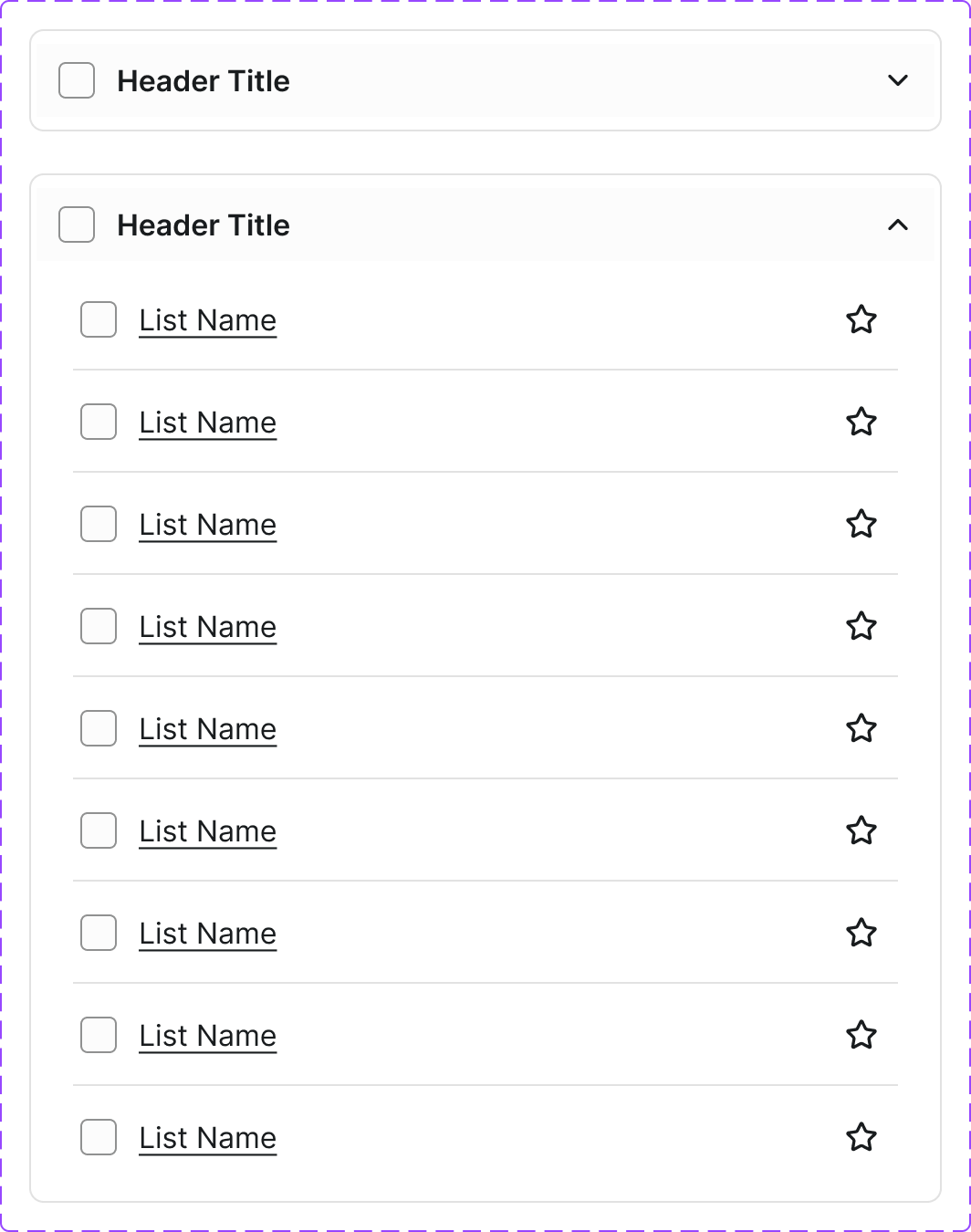
Figma variant properties: State=Collapsed/Expanded/Disabled
Preview
Component preview image — to be added manually from Figma export.
Variants
| Variant |
|---|
| Collapsed |
| Expanded |
| Disabled |
| With icon |
| Single-expand mode |
| Multi-expand mode |
Props
| Property | Type | Default | Description |
|---|---|---|---|
items |
AccordionItem[] | [] | Array of {title, content} objects |
allowMultiple |
boolean | false | Allow multiple panels open simultaneously |
defaultOpen |
string[] | [] | IDs of items open by default |
Usage
Do
- Use to progressively disclose content on long pages.
- Allow multiple panels open when comparing sections.
- Use clear, descriptive headings.
Don't
- Don't hide required information in an accordion.
- Don't nest accordions within accordions.
- Don't use for short content that could simply be displayed.
Accessibility
aria-expandedon trigger button.aria-controlslinking to panel.role='region'on panel.- Keyboard: Enter/Space toggle; Tab moves between triggers.
Tokens Used
color.semantic.Background.Primarycolor.semantic.Border.Primarycolor.semantic.Content.Primaryspacing.Mspacing.LborderRadius.S