Toast
A brief, non-intrusive notification that appears above other content to provide feedback about an action or system event. Auto-dismisses after a set duration.
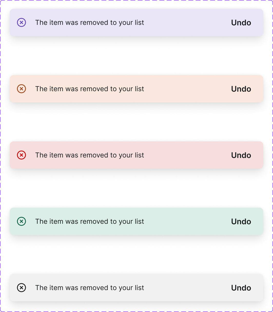
Figma variant properties: Status=Success/Error/Warning/Info
Preview
Component preview image — to be added manually from Figma export.
Variants
| Variant |
|---|
| Success |
| Error |
| Warning |
| Info |
| With action button |
Props
| Property | Type | Default | Description |
|---|---|---|---|
message |
string | "" | Notification message text |
status |
"success" | "error" | "warning" |
duration |
number | 5000 | Auto-dismiss delay in milliseconds (0 = persist) |
action |
string | null | Optional action button label |
Usage
Do
- Use for brief, time-sensitive feedback that doesn't require immediate action.
- Position consistently (bottom-right by default).
- Limit to one toast at a time.
Don't
- Don't use toasts for critical errors requiring user action — use Modal instead.
- Don't put long text in toasts.
- Don't stack multiple toasts.
Accessibility
role='alert'for errors,role='status'for informational.aria-live='polite'or'assertive'.- Respect
prefers-reduced-motionfor slide animation. - Provide manual dismiss for long-duration toasts.
Tokens Used
color.semantic.Background.Positivecolor.semantic.Background.Negativecolor.semantic.Background.Attentionelevation.L6borderRadius.Sspacing.M