Product Card
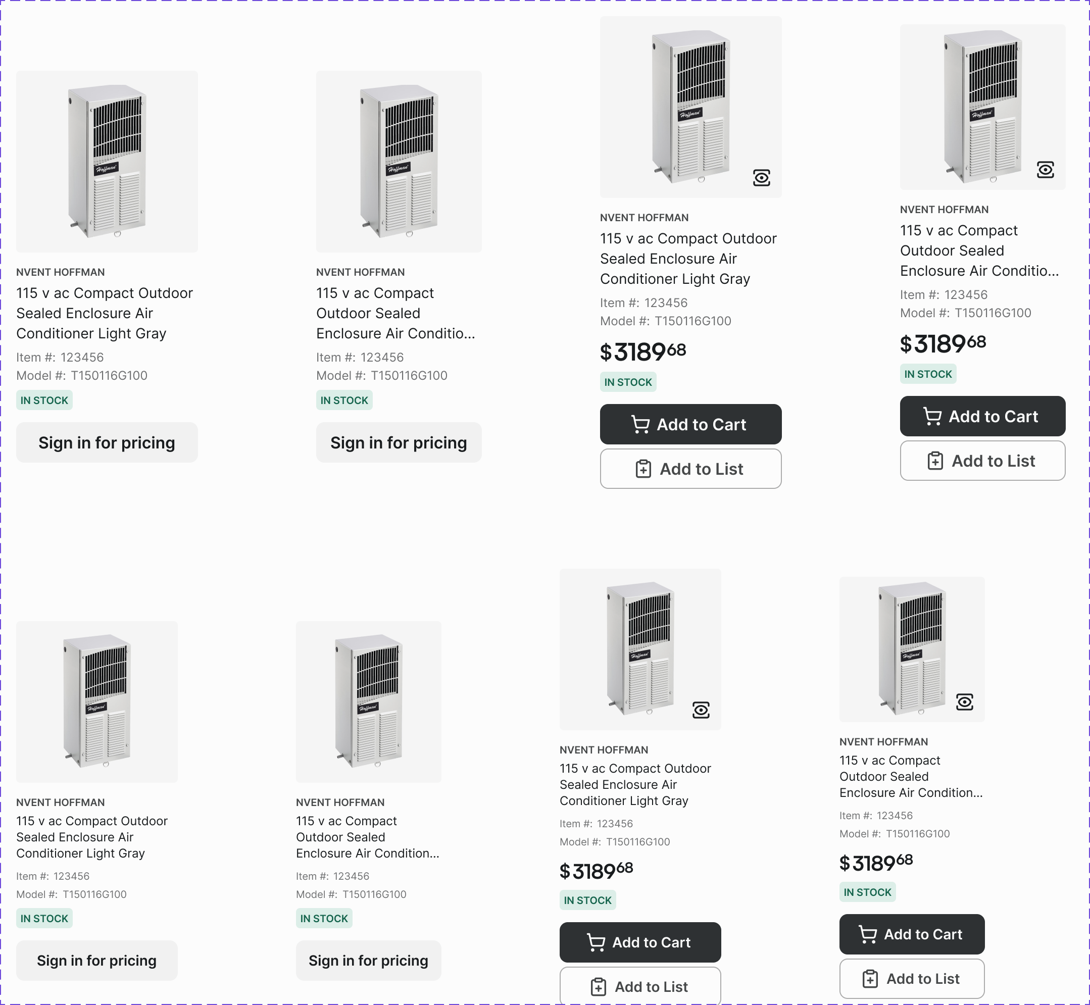
A card displaying a single product's key information: image, name, SKU, price, and add-to-cart action. The primary unit of product discovery.
Figma variant properties: Border=Yes/No, Usage=Grid/List/Featured
Preview
Component preview image — to be added manually from Figma export.
Variants
| Variant |
|---|
| With border / Without border |
| Usage: Grid / List / Featured |
| With tag |
| Out of stock |
| On sale |
Props
| Property | Type | Default | Description |
|---|---|---|---|
name |
string | "" | Product name |
sku |
string | "" | Product SKU |
price |
string | "" | Formatted price string |
image |
string | null | Product image URL |
border |
boolean | true | Show card border |
usage |
"grid" | "list" | "featured" |
outOfStock |
boolean | false | Out-of-stock state |
onSale |
boolean | false | Show sale indicator |
Usage
Do
- Use Grid variant for category/search results pages.
- Use List variant for compact views (mobile, order summaries).
- Always show SKU — it's the primary identifier for B2B buyers.
Don't
- Don't hide the SKU on any product card variant.
- Don't omit the 'Add to Cart' action from the grid card.
- Don't use more than 2 promotional tags per card.
Accessibility
- Product link wraps the entire card for maximum click target.
- Image alt text = product name.
aria-labelon Add-to-Cart includes product name.- Out-of-stock communicated via text, not color alone.
Tokens Used
color.semantic.Background.Primarycolor.semantic.Border.PrimaryborderRadius.Selevation.L1typography.heading.2XStypography.text.S.regularspacing.Mspacing.L