Tag
A compact label used to categorize or describe content. Tags are typically used in product listings, filters, and content metadata. Can be removable in an input context.
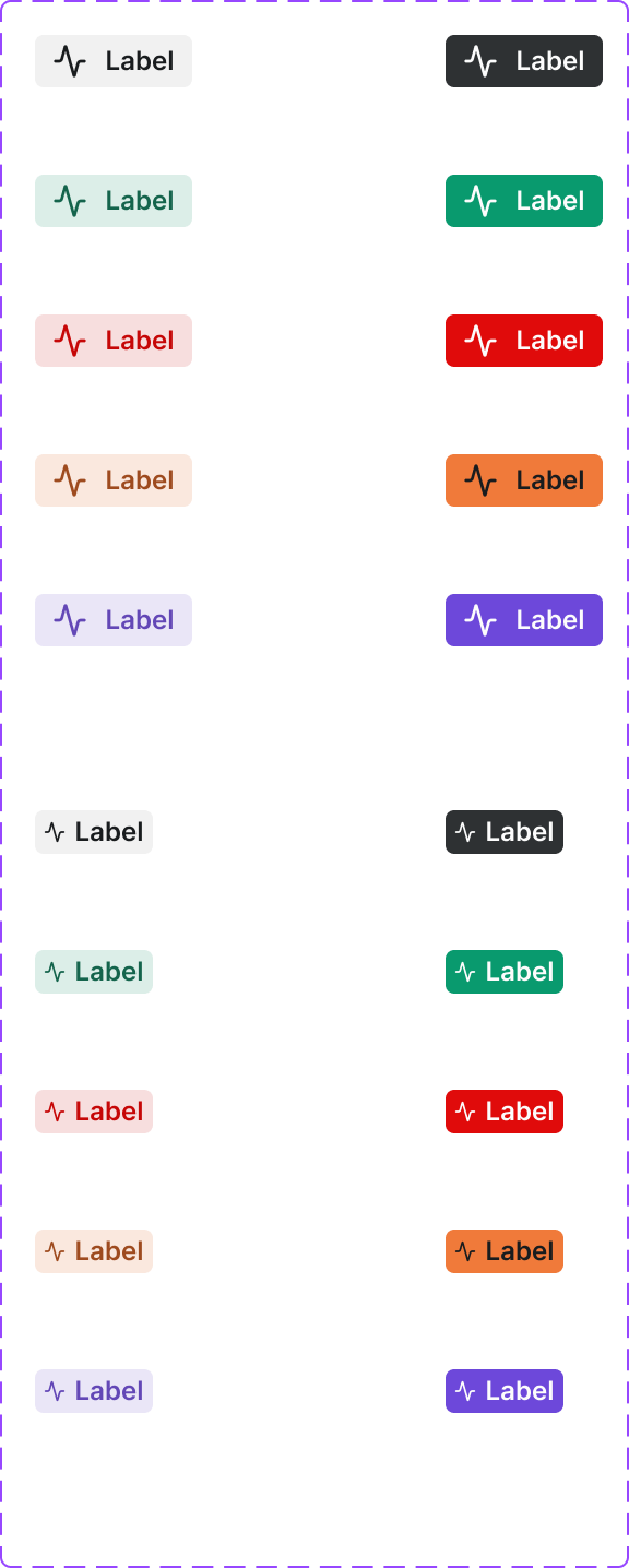
Figma variant properties: Context=Default/Info/Success/Warning/Error, State=Default/Hover/Removable
Preview
Component preview image — to be added manually from Figma export.
Variants
| Variant |
|---|
| Default |
| Removable |
| Clickable / Filterable |
| With icon |
| Context variants |
Props
| Property | Type | Default | Description |
|---|---|---|---|
label |
string | "" | Tag text |
context |
string | "default" | Semantic context |
removable |
boolean | false | Shows remove button |
icon |
string | null | Lucide icon name |
Usage
Do
- Use tags to label, categorize, or describe attributes of content.
- Use removable variant in multi-select input contexts.
- Keep tag text under 3 words.
Don't
- Don't use tags as navigation elements.
- Don't use too many tags on a single item — 3–4 max.
- Don't use tags for critical status — use Pill for status.
Accessibility
- Removable tags need
aria-label='Remove [tag name]'on the dismiss button. - Clickable tags use
role='button'or<button>wrapper. - Ensure adequate contrast.
Tokens Used
color.semantic.Background.Tonalcolor.semantic.Border.PrimaryborderRadius.XStypography.text.XS.semiboldspacing.XS