Navbar
The primary site navigation header. Contains brand identity, main navigation links, search, cart, and account actions. Responsive across Desktop, Tablet, and Mobile breakpoints.
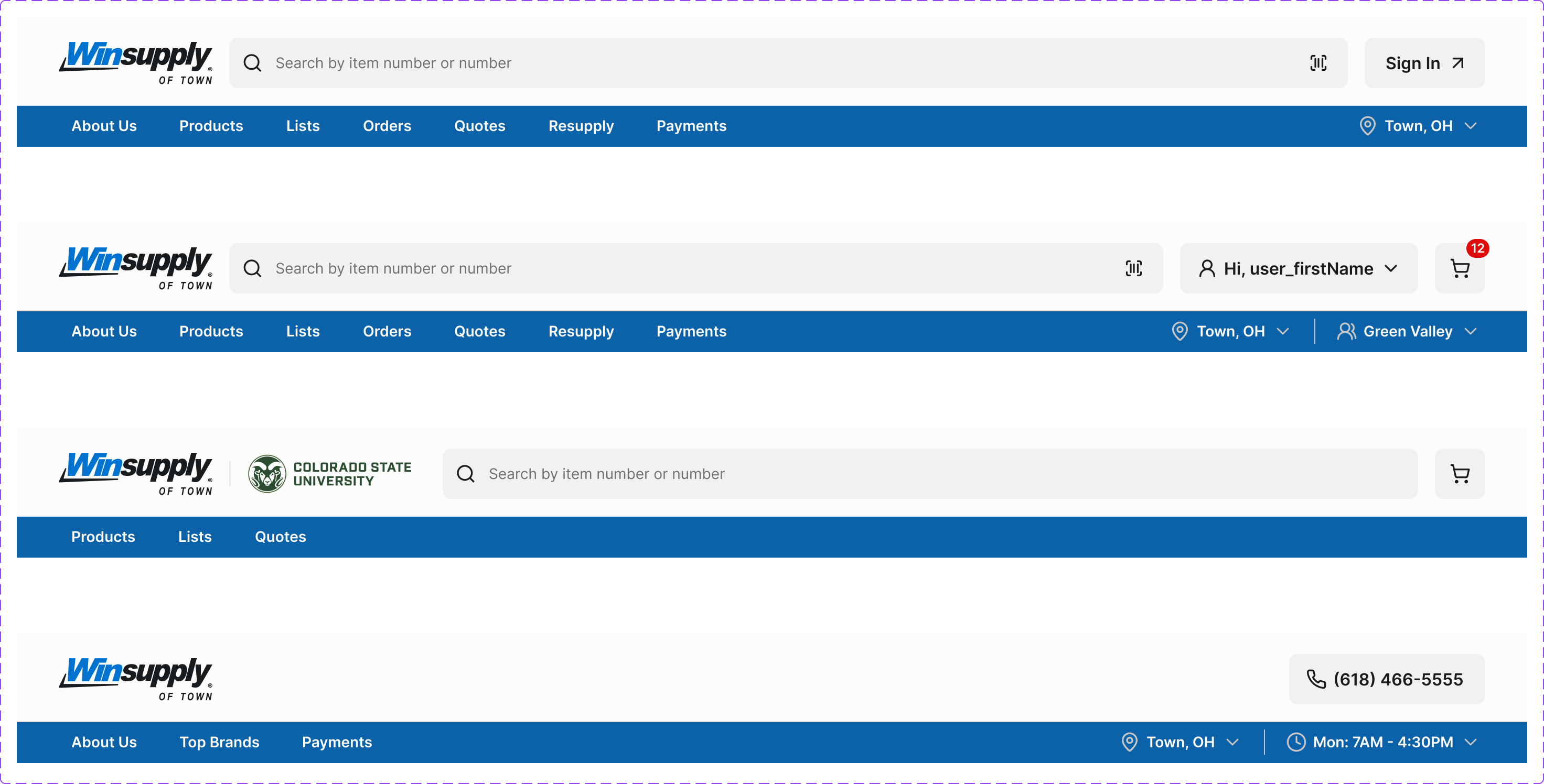
Figma variant properties: Device=Desktop/Tablet/Mobile, Type=Standard/Compact, State=Default/Scrolled
Preview
Component preview image — to be added manually from Figma export.
Variants
| Variant |
|---|
| Device: Desktop / Tablet / Mobile |
| Type: Standard / Compact / Mega-menu |
| State: Default / Scrolled / Drawer Open |
Props
| Property | Type | Default | Description |
|---|---|---|---|
device |
"desktop" | "tablet" | "mobile" |
type |
"standard" | "compact" | "mega" |
activeItem |
string | null | ID of currently active nav item |
cartCount |
number | 0 | Number of items in cart (drives Badge counter) |
isLoggedIn |
boolean | false | Show authenticated vs guest account state |
Usage
Do
- Include skip-to-main-content link as the first focusable element.
- Mark the active section with
aria-current='page'. - Collapse to hamburger on mobile.
Don't
- Don't put more than 7 top-level items in the navbar.
- Don't use the navbar to surface secondary/utility links — use the footer.
Accessibility
- Skip link must be first focusable element.
<nav>witharia-label='Main navigation'.- Mobile hamburger:
aria-expanded,aria-controls. - Keyboard-navigable without mouse.
Tokens Used
color.semantic.Background.Primarycolor.semantic.Content.Primarycolor.semantic.Content.Linkelevation.L3typography.text.M.semiboldspacing.Mspacing.L