Checkbox
A binary or multi-select input that lets users choose one or more independent options from a list. Checkboxes are always used within a form context.
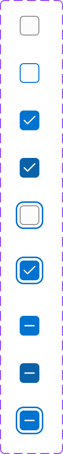
Figma variant properties: State=Default/Hover/Focused/Checked/Indeterminate/Disabled/Error
Preview
Component preview image — to be added manually from Figma export.
Variants
| Variant |
|---|
| Unchecked |
| Checked |
| Indeterminate |
| Disabled |
| Error state |
| With helper text |
Props
| Property | Type | Default | Description |
|---|---|---|---|
label |
string | "" | Visible label for the checkbox |
checked |
boolean | false | Checked state |
indeterminate |
boolean | false | Partially checked (e.g., parent of mixed children) |
disabled |
boolean | false | Disabled state |
error |
boolean | false | Error state with error message |
helperText |
string | null | Optional helper text below label |
Usage
Do
- Use for selecting multiple independent options from a list.
- Group related checkboxes under a shared
<fieldset>and<legend>. - Use Indeterminate when some (not all) children are selected.
Don't
- Don't use checkboxes for mutually exclusive options — use Radio instead.
- Don't use a single standalone checkbox as a 'toggle' — use the Toggle component.
- Don't submit a form without clear indication of which items are selected.
Accessibility
- Use
<input type='checkbox'>with an associated<label>. - Support Space to toggle.
- Announce state changes with
aria-checked. - Include
aria-describedbyfor helper/error text.
Tokens Used
color.semantic.Background.Brandcolor.semantic.Border.Primarycolor.semantic.Border.FocusborderRadius.XStypography.text.M.regular