Footer
The site-wide footer component containing navigational links, legal copy, and brand identity. Available in multiple type configurations for different page contexts.
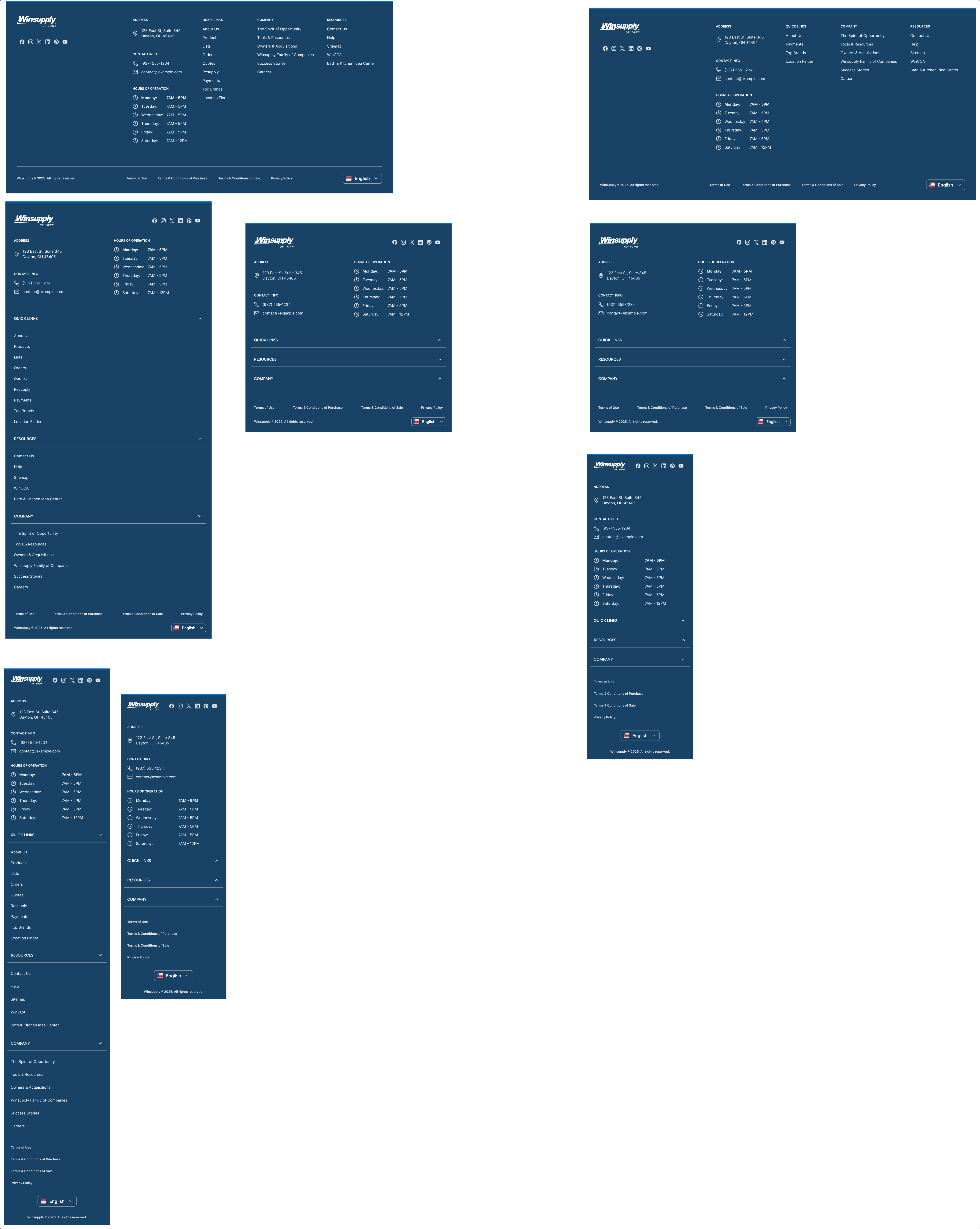
Figma variant properties: Type=Full/Minimal/App
Preview
Component preview image — to be added manually from Figma export.
Variants
| Variant |
|---|
| Type: Full / Minimal / App |
Props
| Property | Type | Default | Description |
|---|---|---|---|
type |
"Full" | "Minimal" | "App" |
links |
FooterLink[] | [] | Navigation link groups |
legalText |
string | "" | Copyright and legal copy |
showLocale |
boolean | true | Show country/locale selector |
Usage
Do
- Use 'Full' on marketing and category pages.
- Use 'Minimal' on checkout and narrow-focus pages.
- Always include copyright and privacy links.
Don't
- Don't remove the footer from checkout flows entirely — keep a minimal version.
- Don't overload the footer with more than 4 link columns.
Accessibility
- Footer
<nav>elements need distinctaria-labelvalues. - All links must be keyboard-navigable.
- Legal text must meet minimum contrast.
Tokens Used
color.semantic.Background.Primarycolor.semantic.Content.Secondarycolor.semantic.Content.Linktypography.text.S.regularspacing.XLspacing.2XL