Segmented Control
A horizontal set of mutually exclusive options that switch between views or filter states. Combines the appearance of a button group with the behavior of radio buttons.
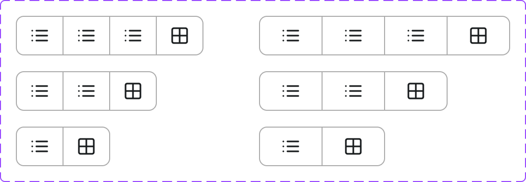
Figma variant properties: # of Options=2/3/4/5, Style=Filled/Outlined
Preview
Component preview image — to be added manually from Figma export.
Variants
| Variant |
|---|
| 2 options |
| 3 options |
| 4 options |
| 5 options |
| Style: Filled / Outlined |
Props
| Property | Type | Default | Description |
|---|---|---|---|
options |
string[] | [] | Array of option labels |
selected |
string | null | Currently selected option |
style |
"filled" | "outlined" | "filled" |
onChange |
function | null | Selection change handler |
Usage
Do
- Use for filtering or switching between 2–5 related views.
- Keep option labels concise (1–2 words).
- Default to the most common/useful option.
Don't
- Don't use for more than 5 options — use Tabs or a Select.
- Don't use for form submission — use Radio buttons.
- Don't use for navigation between pages.
Accessibility
role='radiogroup'on container.role='radio'witharia-checkedon each option.- Arrow keys navigate between options.
- Visible focus ring on active option.
Tokens Used
color.semantic.Background.Brandcolor.semantic.Background.Tonalcolor.semantic.Content.PrimaryborderRadius.Stypography.text.M.semiboldspacing.M