Button Circle
A circular icon-only button used for actions where the icon alone is self-explanatory (e.g., close, add, search). Always requires an accessible label.
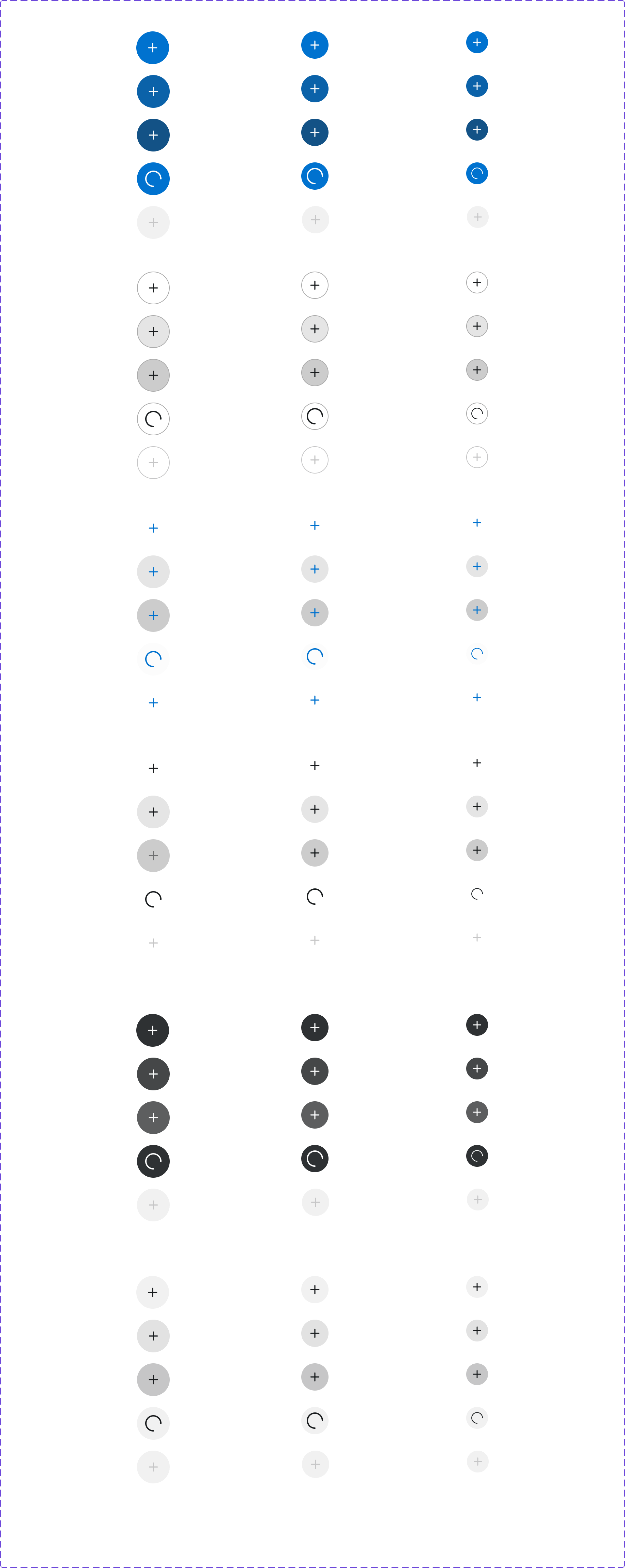
Figma variant properties: Size=S/M/L/XL, Type=Primary/Secondary/Ghost/Destructive, State=Default/Hover/Pressed/Disabled
Preview
Component preview image — to be added manually from Figma export.
Variants
| Variant |
|---|
| Size: S / M / L / XL |
| Primary |
| Secondary |
| Ghost |
| Destructive |
| Disabled |
Props
| Property | Type | Default | Description |
|---|---|---|---|
icon |
string | "" | Lucide icon name |
ariaLabel |
string | "" | Required accessible label (visually hidden) |
size |
"S" | "M" | "L" |
type |
"Primary" | "Secondary" | "Ghost" |
disabled |
boolean | false | Disables the button |
Usage
Do
- Always include
aria-labeldescribing the action. - Use for high-frequency actions within a dense UI (e.g., quantity +/-).
- Use
borderRadius.Circle(50%) shape.
Don't
- Don't use without an accessible label.
- Don't use for primary page-level actions — use Button instead.
- Don't create new icon meanings — stick to Lucide conventions.
Accessibility
- Mandatory
aria-label— the icon carries no semantic meaning to assistive technology. - Minimum 44×44px touch target.
- Visible focus ring required.
Tokens Used
color.semantic.Background.BrandborderRadius.Circlespacing.M