Drawer
A panel that slides in from the edge of the viewport to display secondary content or navigation without navigating away from the current page.
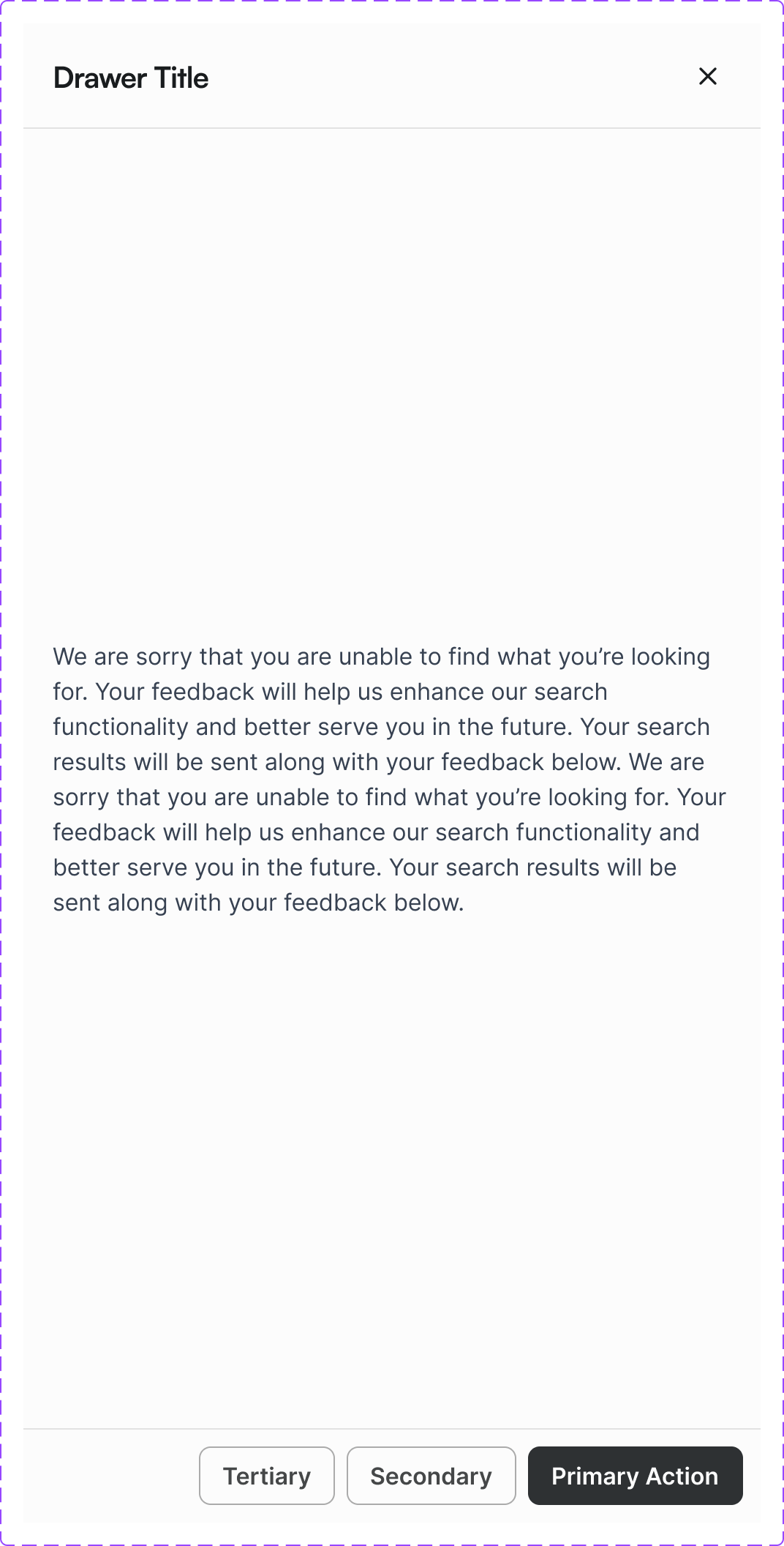
Figma variant properties: Device=Desktop/Mobile, Size=S/M/L/Full
Preview
Component preview image — to be added manually from Figma export.
Variants
| Variant |
|---|
| Size: S / M / L / Full |
| Device: Desktop / Mobile |
| Position: Right (default) / Left / Bottom |
Props
| Property | Type | Default | Description |
|---|---|---|---|
open |
boolean | false | Open state |
size |
"S" | "M" | "L" |
device |
"desktop" | "mobile" | "desktop" |
title |
string | null | Drawer header title |
onClose |
function | null | Close handler |
Usage
Do
- Use for secondary tasks: cart preview, filters, settings.
- Always provide a close button and Escape key dismiss.
- Use 'Full' size on mobile devices.
Don't
- Don't use Drawer for primary navigation on desktop — use Navbar.
- Don't nest drawers.
- Don't use for critical alerts — use Modal.
Accessibility
- Focus trap when open. Return focus to trigger on close.
role='dialog'witharia-modal='true'.aria-labelledbypointing to drawer title.- Dismiss on Escape.
Tokens Used
color.semantic.Background.Primarycolor.semantic.Border.Primaryelevation.L4spacing.Lspacing.XL