Dropdown
A menu that reveals a list of actions or navigation choices when its trigger is activated. Distinct from Select (which captures form values) — Dropdown presents commands.
Figma variant properties: Status=Default/Info/Success/Warning/Error
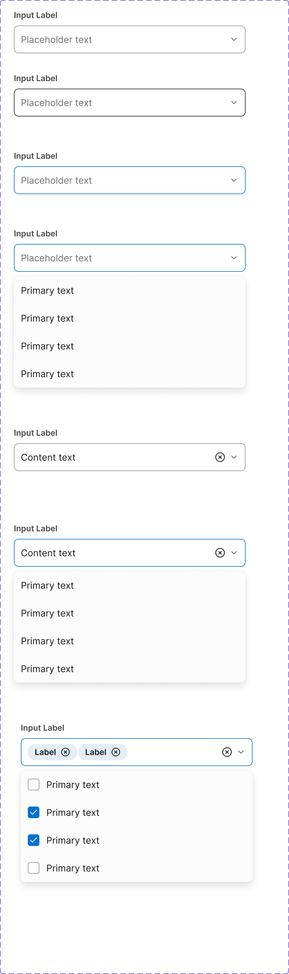
Preview
Component preview image — to be added manually from Figma export.
Variants
| Variant |
|---|
| Default |
| With icons |
| With dividers |
| With destructive item |
| Disabled item |
| Status variants |
Props
| Property | Type | Default | Description |
|---|---|---|---|
trigger |
element | null | Element that opens the dropdown |
items |
DropdownItem[] | [] | Array of |
open |
boolean | false | Controlled open state |
placement |
"bottom-start" | "bottom-end" | "bottom-start" |
Usage
Do
- Use for overflow/contextual action menus.
- Group related actions with dividers.
- Highlight destructive actions in red.
Don't
- Don't use Dropdown for form value selection — use Select.
- Don't put more than 10 items without grouping.
- Don't use for primary navigation.
Accessibility
aria-expandedandaria-haspopup='menu'on trigger.role='menu'on list,role='menuitem'on items.- Arrow keys navigate; Escape closes; Enter/Space activates.
- Focus returns to trigger on close.
Tokens Used
color.semantic.Background.Inversecolor.semantic.Border.Primaryelevation.L2borderRadius.Mtypography.text.M.regularspacing.Sspacing.M