Popover
A floating overlay panel triggered by clicking a button. Unlike tooltips, popovers are click-activated and can contain rich interactive content.
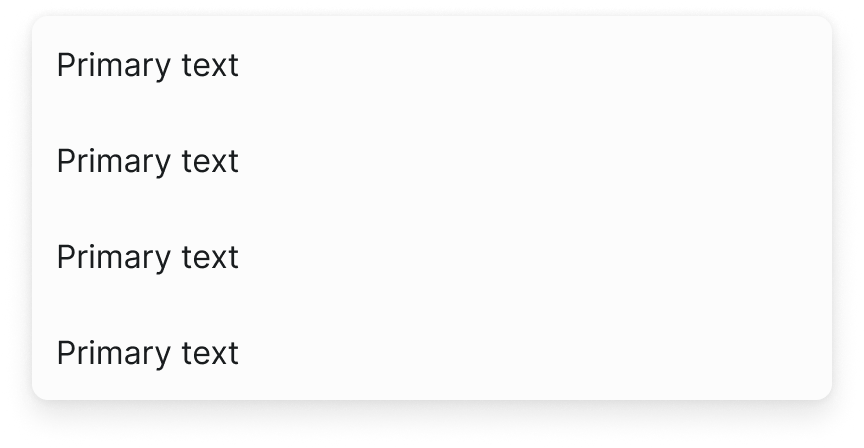
Figma variant properties: Content/Header-Row=True/False, Status=Default/Info/Success/Warning/Error
Preview
Component preview image — to be added manually from Figma export.
Variants
| Variant |
|---|
| Default |
| With header |
| With header and status |
| With actions |
| Positioned: top/right/bottom/left |
Props
| Property | Type | Default | Description |
|---|---|---|---|
trigger |
element | null | Element that opens the popover |
open |
boolean | false | Controlled open state |
placement |
"top" | "right" | "bottom" |
showHeader |
boolean | false | Show header row |
title |
string | null | Header title text |
Usage
Do
- Use for secondary information or actions that shouldn't interrupt the main flow.
- Provide a visible close button.
- Dismiss on Escape or click-outside.
Don't
- Don't put essential required information in a popover.
- Don't trigger popovers on hover — use Tooltip instead.
- Don't nest popovers.
Accessibility
aria-expandedon trigger.aria-controlslinking to popoverid.role='dialog'for modal popovers.- Focus trap when modal. Escape closes and returns focus.
Tokens Used
color.semantic.Background.Inversecolor.semantic.Border.Primaryelevation.L2borderRadius.Mspacing.M