Badge
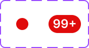
A small label appearing inside or near another UI element to represent a status, count, or metadata. Also used as a notification counter.
Figma variant properties: Counter?=Yes/No
Preview
Component preview image — to be added manually from Figma export.
Variants
| Variant |
|---|
| Default |
| Counter (with number) |
| Removable |
Props
| Property | Type | Default | Description |
|---|---|---|---|
label |
string | "" | Text content of the badge |
variant |
string | "default" | Visual style variant |
counter |
boolean | false | Renders as a numeric counter badge |
Usage
Do
- Use badges to indicate status, category, or count.
- Keep label text under 3 words.
- Use Counter variant for notification counts.
Don't
- Don't use badges as the primary call to action.
- Don't rely solely on color to communicate meaning.
Accessibility
- Ensure color contrast meets WCAG AA.
- Add
aria-labelif the badge communicates critical status. - Don't use badge text as the only indicator of state.
Tokens Used
color.semantic.Background.Brandcolor.semantic.Content.PrimaryborderRadius.XStypography.text.XS.semibold