Radio Button
A single-select input that lets users choose exactly one option from a predefined list. Radio buttons in a group are mutually exclusive.
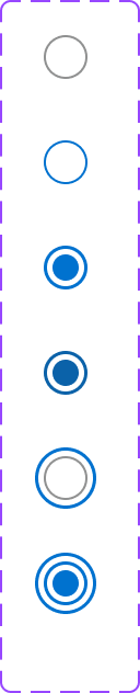
Figma variant properties: State=Default/Hover/Focused/Selected/Disabled/Error
Preview
Component preview image — to be added manually from Figma export.
Variants
| Variant |
|---|
| Default |
| Selected |
| Disabled |
| Error state |
| With helper text |
Props
| Property | Type | Default | Description |
|---|---|---|---|
label |
string | "" | Radio option label |
checked |
boolean | false | Selected state |
disabled |
boolean | false | Disabled state |
helperText |
string | null | Secondary description below label |
Usage
Do
- Use for 2–5 mutually exclusive options.
- Wrap groups in
<fieldset>with<legend>. - Default to the most likely option pre-selected when appropriate.
Don't
- Don't use for more than 5 options — use Select instead.
- Don't use a single radio — that's a checkbox.
- Don't use radio groups for actions — use buttons.
Accessibility
- Arrow keys navigate within the group.
aria-checkedfor state.role='radiogroup'on wrapper.- Associate every radio with a
<label>.
Tokens Used
color.semantic.Background.Brandcolor.semantic.Border.Primarycolor.semantic.Border.FocusborderRadius.Circle