Button
An interactive control that triggers an action. Buttons communicate what will happen when activated and are available in multiple visual hierarchies and sizes.
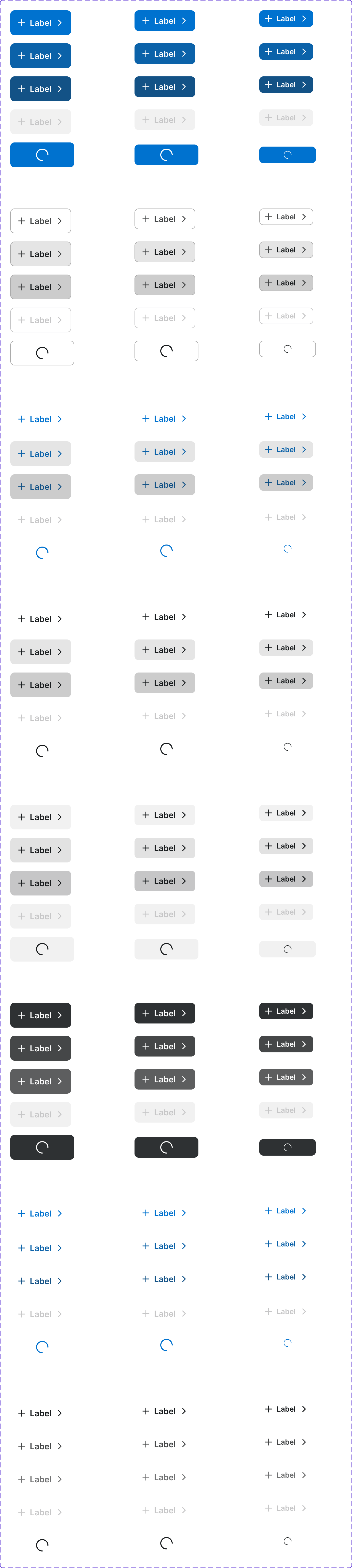
Figma variant properties: Size=S/M/L, Type=Primary/Secondary/Ghost/Destructive, State=Default/Hover/Pressed/Disabled/Loading
Preview
Component preview image — to be added manually from Figma export.
Variants
| Variant |
|---|
| Primary |
| Secondary |
| Tertiary |
| Ghost |
| Destructive |
| Size: S / M / L |
| Icon + Label |
| Icon Only |
| Loading |
| Disabled |
Props
| Property | Type | Default | Description |
|---|---|---|---|
label |
string | "" | Button label text |
size |
"S" | "M" | "L" |
type |
"Primary" | "Secondary" | "Tertiary" |
disabled |
boolean | false | Disables the button |
loading |
boolean | false | Shows loading spinner |
iconLeft |
string | null | Lucide icon name to show before label |
iconRight |
string | null | Lucide icon name to show after label |
Usage
Do
- Use clear, action-oriented labels (e.g., 'Add to Cart', 'Save Order').
- Use Primary for the single most important action on a page.
- Maintain minimum 44px touch target on mobile.
Don't
- Don't use more than one Primary button per section.
- Don't use generic labels like 'OK' or 'Click Here'.
- Don't use a button when a link is more appropriate (navigation).
Accessibility
- Use native
<button>element. - Provide
aria-labelfor icon-only buttons. - Communicate disabled state with both visual styling and
disabledattribute. - Include visible focus ring.
Tokens Used
color.semantic.Background.Brandcolor.semantic.Background.BrandHovercolor.semantic.Content.PrimaryborderRadius.Stypography.text.M.semiboldspacing.Mspacing.L