Add-to-Cart Button
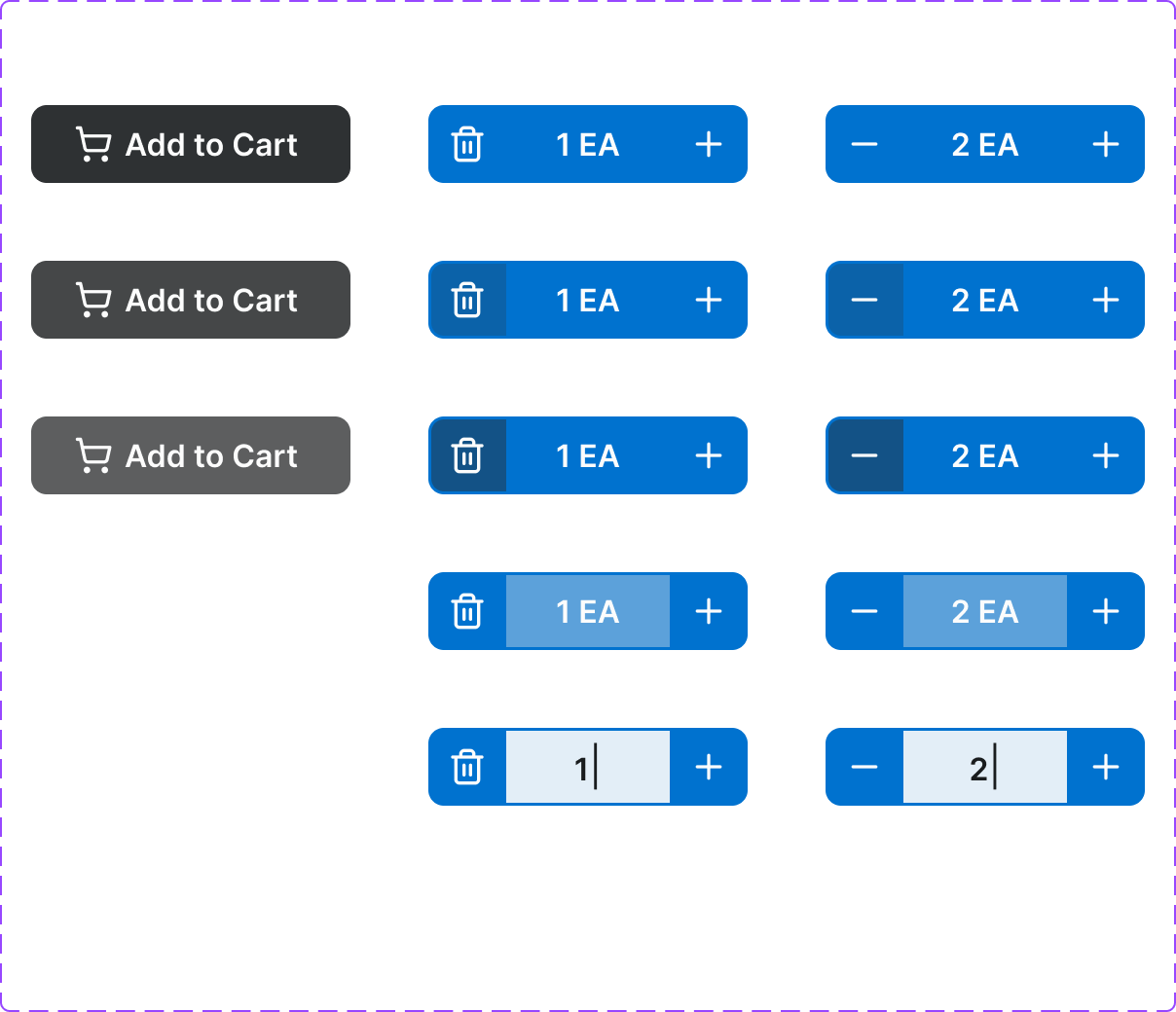
An eCommerce-specific button that initiates the cart-add flow. Includes an animated confirmation state and quantity input integration. A core conversion element.
Figma variant properties: style=Filled/Outlined, State=Default/Loading/Added/Disabled
Preview
Component preview image — to be added manually from Figma export.
Variants
| Variant |
|---|
| Default |
| Loading |
| Added (success) |
| Disabled (out of stock) |
| Style: Filled / Outlined |
Props
| Property | Type | Default | Description |
|---|---|---|---|
label |
string | "Add to Cart" | Button label |
style |
"filled" | "outlined" | "filled" |
disabled |
boolean | false | Out-of-stock or unavailable state |
loading |
boolean | false | Shows loading spinner during cart action |
success |
boolean | false | Confirms item added |
quantity |
number | 1 | Quantity to add |
Usage
Do
- Use as the primary CTA on product pages.
- Confirm success with the 'Added' state before returning to default.
- Include quantity input when the product supports qty selection.
Don't
- Don't use generic 'Submit' — always use 'Add to Cart' or 'Add to Order'.
- Don't disable without a visible reason (show 'Out of Stock' message).
- Don't use more than one Add-to-Cart per product card.
Accessibility
- Announce success state with
aria-live='polite'. - Disabled state needs explanatory text nearby.
aria-labelshould include product name when used in a grid (e.g., 'Add Bolt M8x20 to cart').
Tokens Used
color.semantic.Background.Brandcolor.semantic.Background.BrandHovercolor.semantic.Background.PositiveborderRadius.Stypography.text.M.semiboldspacing.Mspacing.L