Product Carousel
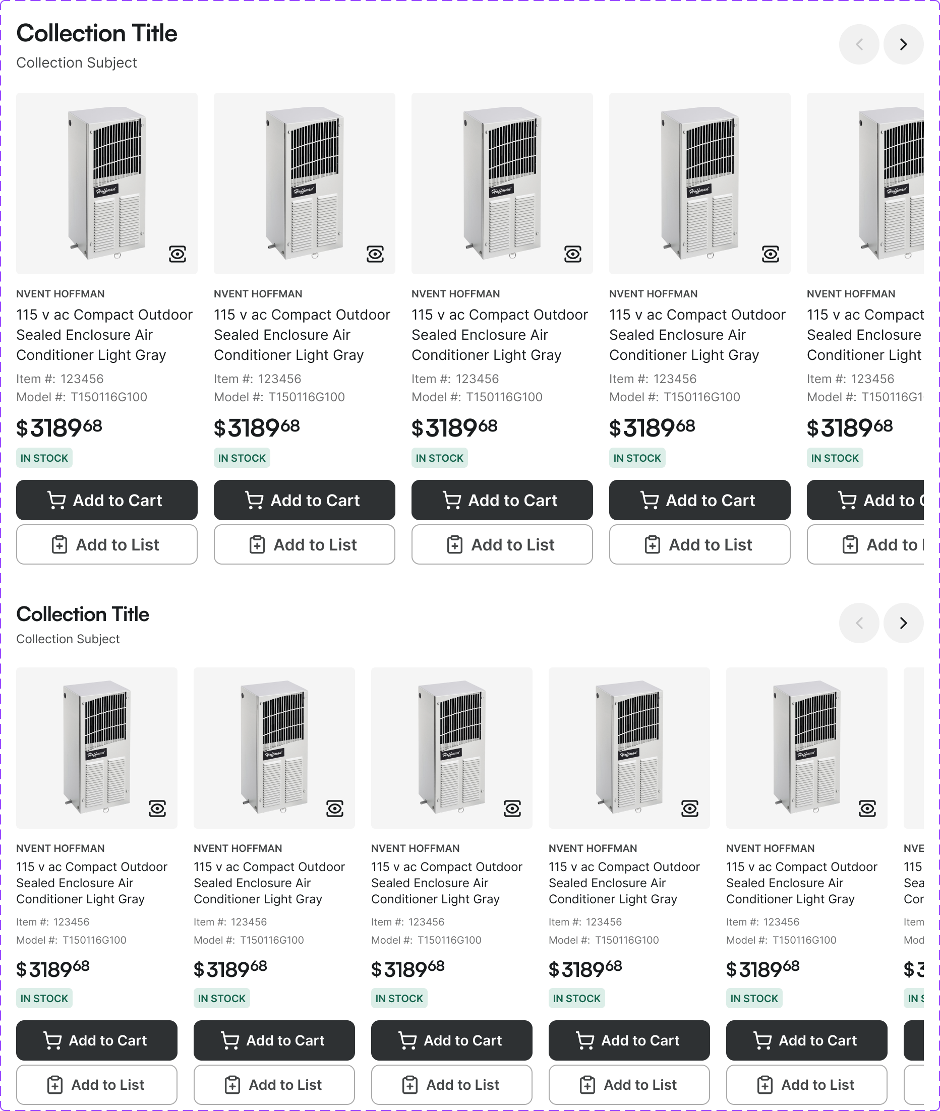
A horizontally scrollable carousel displaying a set of product cards. Used on home pages, category pages, and 'You may also like' recommendation sections.
Figma variant properties: Device=Desktop/Mobile, title-container=Yes/No
Preview
Component preview image — to be added manually from Figma export.
Variants
| Variant |
|---|
| Device: Desktop / Mobile |
| With title header |
| Without title header |
| Auto-scroll / Manual |
Props
| Property | Type | Default | Description |
|---|---|---|---|
products |
Product[] | [] | Array of product objects |
device |
"desktop" | "mobile" | "desktop" |
title |
string | null | Section title above carousel |
autoScroll |
boolean | false | Enable auto-advancing slides |
Usage
Do
- Show partial next card to indicate scrollability.
- Provide prev/next buttons alongside swipe.
- Use lazy loading for product images.
Don't
- Don't auto-scroll without a visible pause control.
- Don't use carousels for essential product discovery — they hide content.
- Don't show more than 5 products per 'page' on desktop.
Accessibility
- Include visible prev/next buttons.
- Hide off-screen cards with
inertoraria-hidden. prefers-reduced-motion: disable auto-scroll.- Each product card is a valid focusable link.
Tokens Used
spacing.Lspacing.XLborderRadius.Scolor.semantic.Background.Primary