Tips
An inline informational callout used to surface helpful context, best practices, or usage guidance within a page — without interrupting the user's flow.
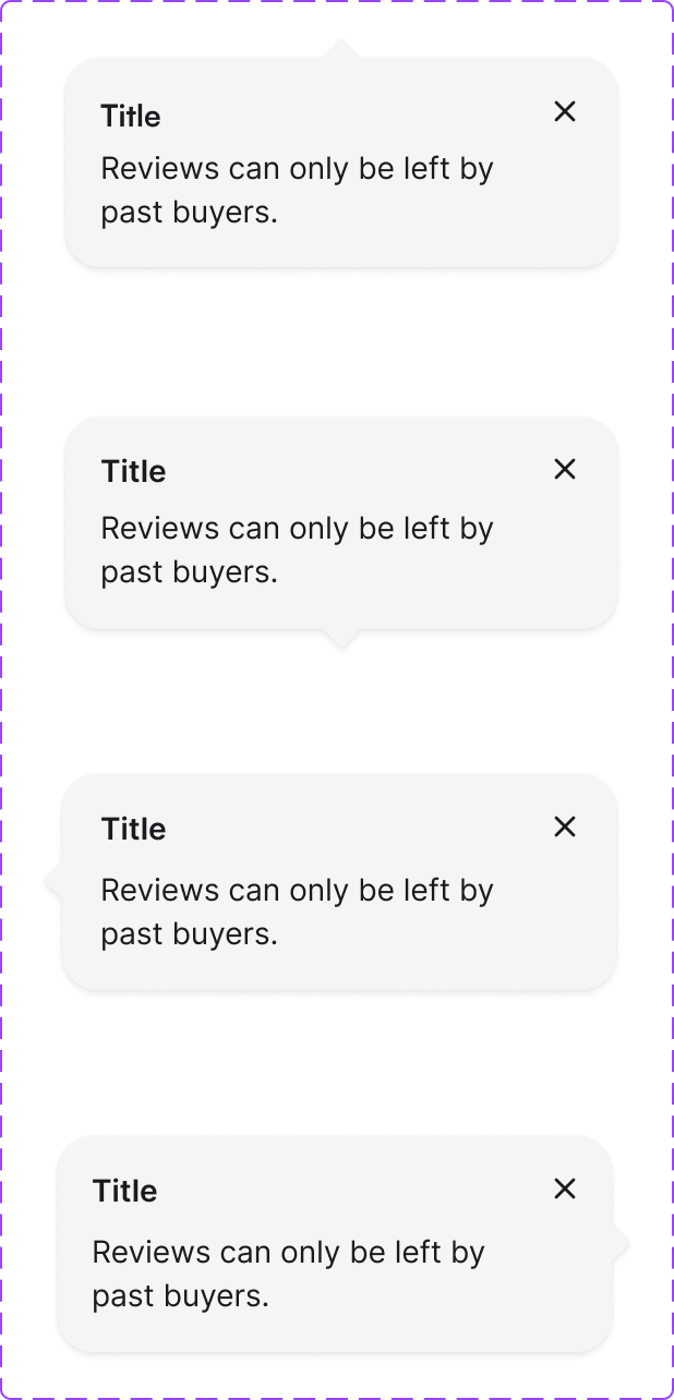
Figma variant properties: Property 1=Default/WithIcon/WithAction
Preview
Component preview image — to be added manually from Figma export.
Variants
| Variant |
|---|
| Default |
| With icon |
| With action link |
| Dismissible |
Props
| Property | Type | Default | Description |
|---|---|---|---|
message |
string | "" | Tip content text |
icon |
string | "info" | Lucide icon name |
dismissible |
boolean | false | Show dismiss button |
actionLabel |
string | null | Optional action link label |
actionHref |
string | null | Optional action link URL |
Usage
Do
- Use to add helpful context without interrupting the primary task.
- Keep tip text concise (1–2 sentences).
- Position tips near the content they relate to.
Don't
- Don't use tips for critical errors — use Toast or inline error messages.
- Don't use dismissible tips for information the user needs to complete a task.
Accessibility
role='note'for static tips.role='status'if content updates dynamically.- Dismiss button needs
aria-label='Dismiss tip'.
Tokens Used
color.semantic.Background.InfoSubtlecolor.semantic.Content.InfoborderRadius.Sspacing.Mtypography.text.M.regular