Toggle
A switch control that represents an immediate binary state — on or off. Use when the change takes effect without requiring a form submission.
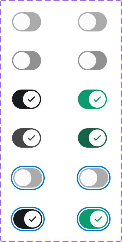
Figma variant properties: State=On/Off/DisabledOn/DisabledOff
Preview
Component preview image — to be added manually from Figma export.
Variants
| Variant |
|---|
| On |
| Off |
| Disabled On |
| Disabled Off |
| With labels |
| Size: S / M / L |
Props
| Property | Type | Default | Description |
|---|---|---|---|
checked |
boolean | false | On/off state |
disabled |
boolean | false | Disabled state |
label |
string | null | Accessible label |
size |
"S" | "M" | "L" |
Usage
Do
- Use toggles for immediate, binary settings (e.g., enable notifications, dark mode).
- Provide a visible label describing what the toggle controls.
Don't
- Don't use toggles within a form that requires submission — use Checkbox instead.
- Don't rely on color alone to show on/off state — include text labels.
Accessibility
role='switch'witharia-checked.- Space/Enter to toggle.
- 44px minimum touch target.
- Announce state changes to screen readers.
Tokens Used
color.semantic.Background.Brandcolor.semantic.Background.TonalborderRadius.Pillspacing.XS