Tooltip
A small informational overlay that appears on hover or focus to provide brief supplementary context for a UI element. Contains non-interactive content only.
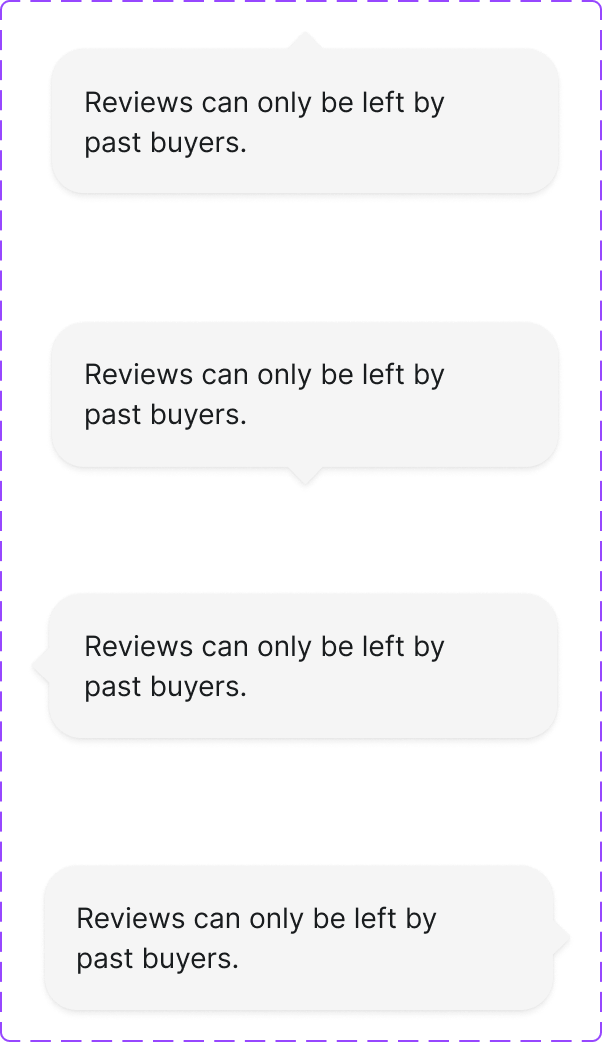
Figma variant properties: Arrow Direction=Top/Right/Bottom/Left/None
Preview
Component preview image — to be added manually from Figma export.
Variants
| Variant |
|---|
| Arrow: top/right/bottom/left/none |
| Default |
| Dark/Light variant |
Props
| Property | Type | Default | Description |
|---|---|---|---|
content |
string | "" | Tooltip text content |
placement |
"top" | "right" | "bottom" |
trigger |
element | null | Element that triggers the tooltip |
Usage
Do
- Use for brief, non-essential clarifications (icon meanings, truncated text).
- Keep content under 10 words.
- Show on both hover and focus.
Don't
- Don't put interactive content in tooltips — use Popover.
- Don't use for critical information that must always be visible.
- Don't trigger on click — that's a Toggletip/Popover.
Accessibility
- Triggered by both
mouseenterandfocus. role='tooltip'with matchingaria-describedbyon trigger.- Dismiss on Escape, mouse leave, and blur.
- Never obscure the trigger element.
Tokens Used
color.semantic.Background.Tonalcolor.semantic.Content.Primaryelevation.L6borderRadius.XStypography.text.XS.regularspacing.XSspacing.S