Pill
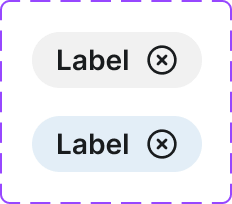
A rounded status indicator used to show the context or category of a piece of content. Similar to badges but specifically pill-shaped and context-driven.
Figma variant properties: Context=Default/Positive/Negative/Attention/Info
Preview
Component preview image — to be added manually from Figma export.
Variants
| Variant |
|---|
| Default |
| With context type |
Props
| Property | Type | Default | Description |
|---|---|---|---|
label |
string | "" | Pill label text |
context |
string | "default" | Semantic context (e.g., success, warning, info) |
Usage
Do
- Use for read-only status or category labeling.
- Keep labels concise.
- Use context variants to reinforce semantic meaning with color.
Don't
- Don't use pills for interactive actions — they are non-clickable by default.
- Don't use pills as the only indicator of status (include text meaning).
Accessibility
- Ensure color + text together communicate the status.
- Don't rely on color alone.
- Include
role='status'if the pill updates dynamically.
Tokens Used
color.semantic.Background.Positivecolor.semantic.Background.Negativecolor.semantic.Background.AttentionborderRadius.Pilltypography.text.XS.semibold