Input
A text input field used to capture a single line of user-entered data. Used in forms, search bars, and anywhere a user needs to provide short text.
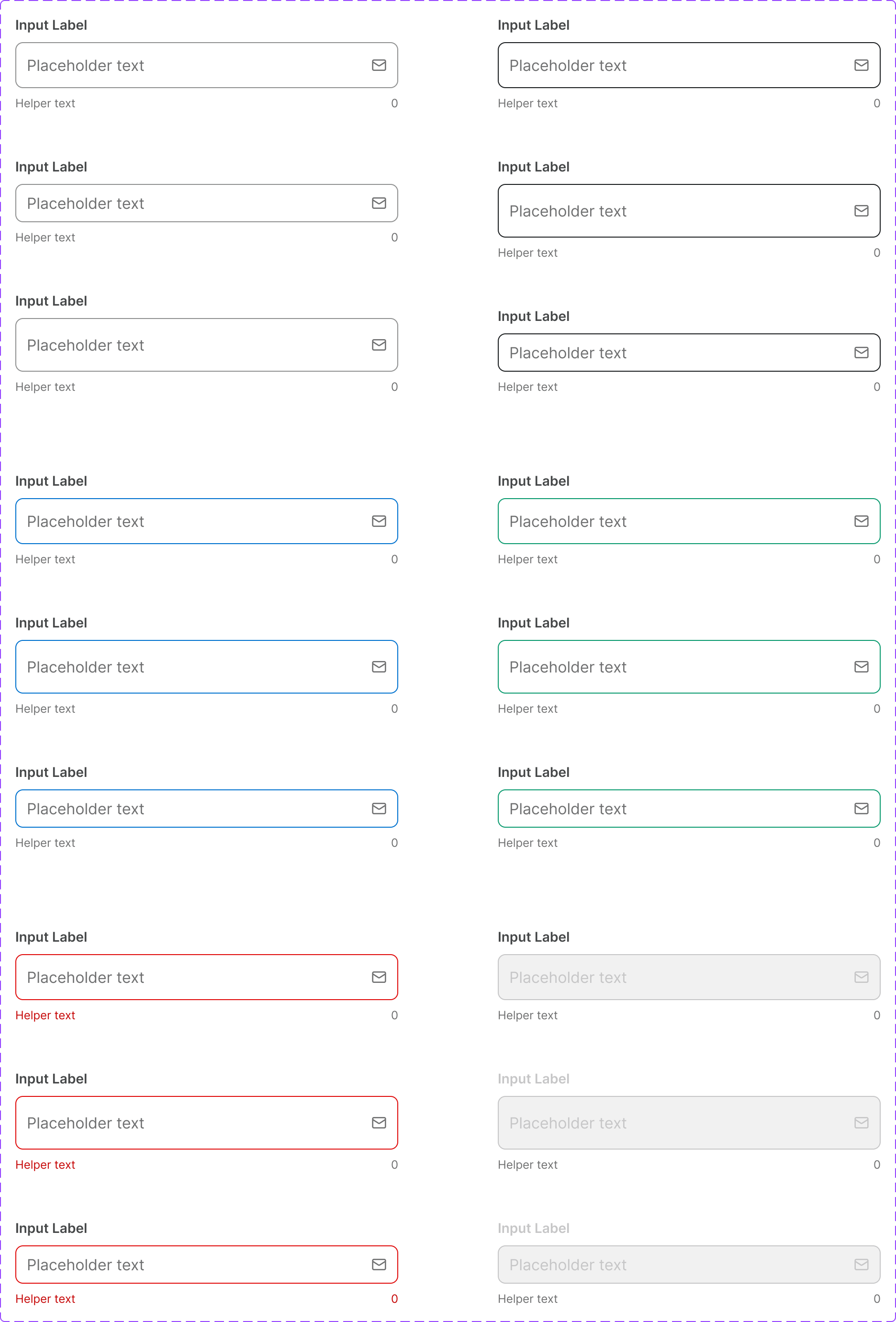
Figma variant properties: Size=S/M, State=Default/Focused/Filled/Disabled/ReadOnly/Error/Success
Preview
Component preview image — to be added manually from Figma export.
Variants
| Variant |
|---|
| Default |
| Focused |
| Filled |
| Disabled |
| Read-only |
| Error |
| Success |
| With label |
| With helper text |
| With leading icon |
| With trailing icon |
| Size: S / M |
Props
| Property | Type | Default | Description |
|---|---|---|---|
label |
string | null | Input label (visually above the field) |
placeholder |
string | "" | Placeholder text |
value |
string | "" | Current value |
size |
"S" | "M" | "M" |
disabled |
boolean | false | Disabled state |
error |
boolean | false | Error state |
errorMessage |
string | null | Error message shown below field |
helperText |
string | null | Helper text below field |
iconLeft |
string | null | Lucide icon name at start |
iconRight |
string | null | Lucide icon name at end |
required |
boolean | false | Marks the field as required |
Usage
Do
- Always associate a visible label with the input.
- Show error messages immediately below the field.
- Use placeholder text for format hints, not labels.
Don't
- Don't rely on placeholder text as the only label.
- Don't use the Input for multi-line text — use Textarea.
- Don't disable inputs without a visible explanation.
Accessibility
- Use
<label>with matchingfor/id. aria-invalid='true'on error state.aria-describedbyfor helper/error text.- Focus ring: 1.5px
Border/Focuscolor.
Tokens Used
color.semantic.Background.Primarycolor.semantic.Border.Primarycolor.semantic.Border.Focuscolor.semantic.Border.DisabledborderRadius.Stypography.text.M.regularspacing.M