Tabs
A navigation pattern that lets users switch between related content panels. Only one panel is visible at a time. Available in responsive variants for Desktop and Mobile.
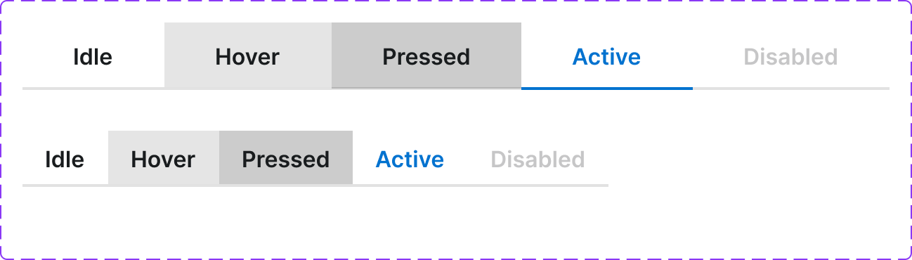
Figma variant properties: Device=Desktop/Mobile, Status=Default/Active/Disabled
Preview
Component preview image — to be added manually from Figma export.
Variants
| Variant |
|---|
| Device: Desktop / Mobile |
| Status: Default / Active / Disabled |
| With icon |
| Without icon |
| Scrollable (many tabs) |
Props
| Property | Type | Default | Description |
|---|---|---|---|
tabs |
Tab[] | [] | Array of {id, label, icon?, content} objects |
activeTab |
string | null | ID of the active tab |
device |
"desktop" | "mobile" | "desktop" |
Usage
Do
- Use when content naturally groups into 2–7 parallel sections.
- On mobile, allow horizontal scrolling if tabs overflow.
- Label tabs with nouns, not actions.
Don't
- Don't use tabs for sequential steps — use a Stepper.
- Don't use tabs for navigation between pages — use Navbar.
- Don't use more than 7 tabs in a single row.
Accessibility
role='tablist'on wrapper.role='tab'+aria-selected+aria-controlson each tab.role='tabpanel'+aria-labelledbyon each panel.- Arrow keys navigate tabs; Tab moves to panel; Shift+Tab returns.
Tokens Used
color.semantic.Background.Primarycolor.semantic.Border.Primarycolor.semantic.Content.Brandtypography.text.M.semiboldspacing.Mspacing.L