Modal
An overlay dialog that demands user attention and interaction before returning to the underlying page. Used for confirmations, forms, and focused tasks.
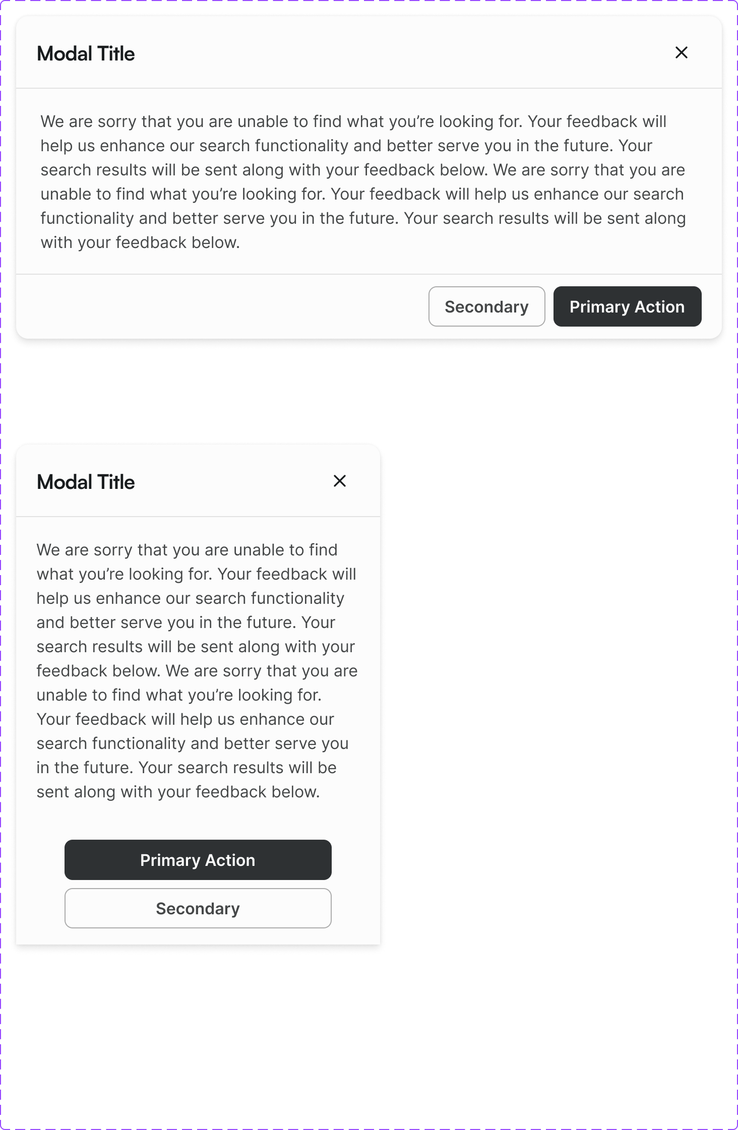
Figma variant properties: Size=S/M/L/Full, Modal/Header=Yes/No
Preview
Component preview image — to be added manually from Figma export.
Variants
| Variant |
|---|
| Size: S / M / L / Full |
| With header |
| With footer actions |
| Scrollable body |
| Destructive confirmation |
Props
| Property | Type | Default | Description |
|---|---|---|---|
open |
boolean | false | Open state |
size |
"S" | "M" | "L" |
title |
string | "" | Modal header title |
onClose |
function | null | Close handler |
closeOnBackdrop |
boolean | true | Close on backdrop click |
Usage
Do
- Use for focused tasks requiring completion before returning (confirmations, forms).
- Always provide a clear title and visible close button.
- Scroll content within the modal — don't extend the modal height beyond the viewport.
Don't
- Don't use modals for informational content that could be inline.
- Don't nest modals.
- Don't auto-open modals on page load (except cookie consent).
Accessibility
- Focus trap: tab cycles through focusable elements within modal only.
role='dialog'witharia-modal='true'.aria-labelledbypointing to modal title.- Escape closes; focus returns to trigger.
Tokens Used
color.semantic.Background.Primarycolor.semantic.Border.Primaryelevation.L5borderRadius.Mspacing.Lspacing.XL