Quantity Box
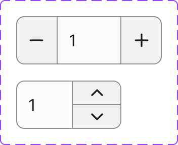
A compact numeric input control with increment and decrement buttons, used wherever a user needs to specify a count — most commonly in add-to-cart and cart line-item flows.
Figma variant properties: Style=Filled/Outlined
Preview
Component preview image — fetched from Figma export.
Variants
| Variant |
|---|
| Style: Filled / Outlined |
| Default |
| Focused |
| Disabled |
| Error |
Props
| Property | Type | Default | Description |
|---|---|---|---|
value |
number | 1 | Current quantity |
min |
number | 1 | Minimum allowed value |
max |
number | 999 | Maximum allowed value |
step |
number | 1 | Increment/decrement step |
style |
"filled" | "outlined" | "outlined" | Visual style |
disabled |
boolean | false | Disabled state |
error |
boolean | false | Error state |
errorMessage |
string | null | Error message shown below |
Usage
Do
- Use for numeric quantities in cart or order-entry contexts.
- Enforce a sensible minimum (usually 1) and a max based on available stock.
- Pair with the Add to Cart Button component.
Don't
- Don't use for non-integer or fractional quantities without clear indication.
- Don't use for general form number inputs — use a plain Input instead.
- Don't allow the user to type values outside the min/max without validation feedback.
Accessibility
- The input must have a visible label or
aria-label. - Decrement and increment buttons need
aria-label("Decrease quantity" / "Increase quantity"). - Disable the decrement button at
minand increment button atmax. aria-invalidandaria-describedbyon error.
Tokens Used
color.semantic.Background.Primarycolor.semantic.Border.Primarycolor.semantic.Border.FocusborderRadius.Stypography.text.M.regularspacing.Sspacing.M