Chip
A compact, interactive element used to represent an input, attribute, or action. Chips can be selectable, removable, or used as filter controls.
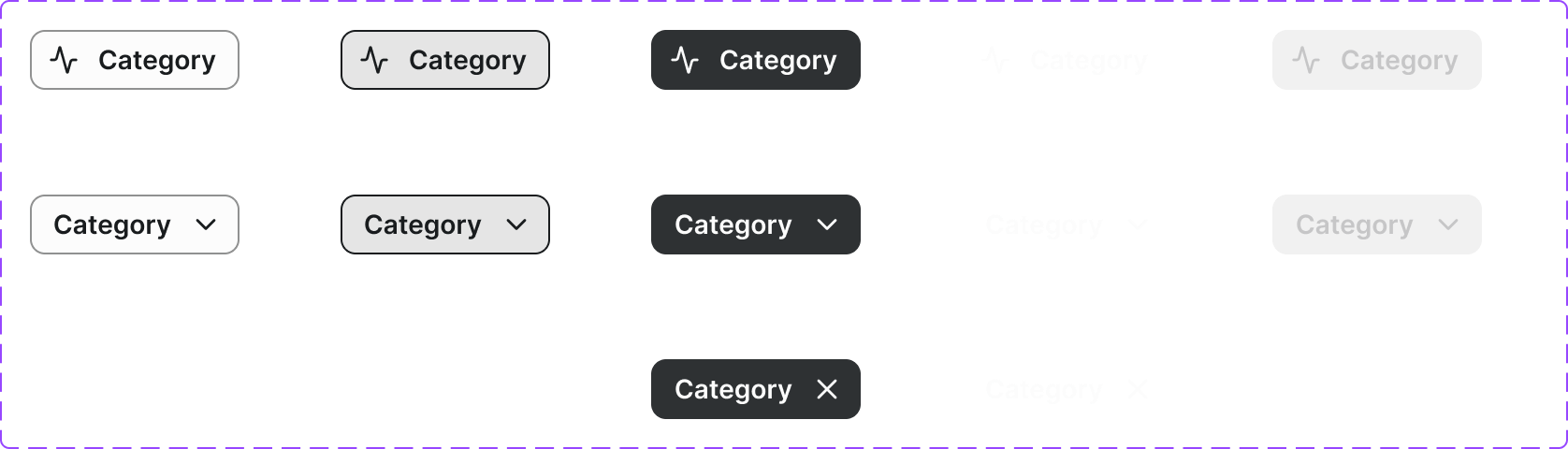
Figma variant properties: State=Default/Hover/Focused/Selected/Disabled
Preview
Component preview image — to be added manually from Figma export.
Variants
| Variant |
|---|
| Default |
| Selected |
| Disabled |
| With Icon |
| Removable |
Props
| Property | Type | Default | Description |
|---|---|---|---|
label |
string | "" | Chip label text |
selected |
boolean | false | Selected/active state |
removable |
boolean | false | Shows a dismiss button |
disabled |
boolean | false | Disabled state |
icon |
string | null | Lucide icon name (optional) |
Usage
Do
- Use chips for filter selection, tag display, or attribute representation.
- Keep chip labels short (1–3 words).
- Group related chips together.
Don't
- Don't use chips as primary navigation.
- Don't use chips for actions that could be buttons.
- Don't overflow chip groups without a 'show more' affordance.
Accessibility
- Ensure 44px minimum touch target.
- Removable chips need
aria-label='Remove [chip name]'on the dismiss button. - Selectable chips should use
aria-pressedoraria-selected.
Tokens Used
color.semantic.Background.Tonalcolor.semantic.Border.PrimaryborderRadius.Pilltypography.text.S.semiboldspacing.XSspacing.M