Location Card
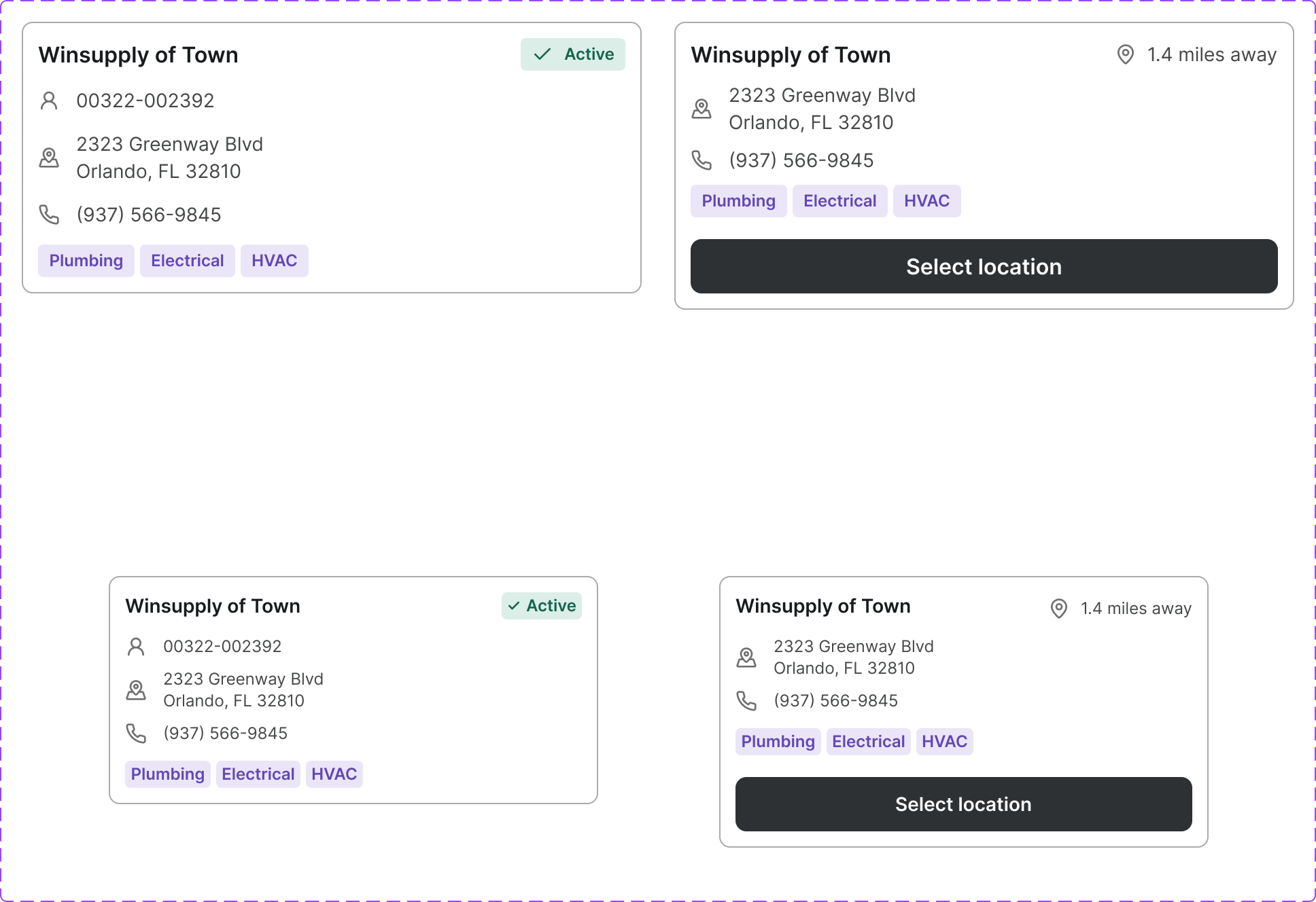
A card that displays a physical branch or store location with address, hours, contact information, and selection state. Used in store-finder and branch-selector flows.
Figma variant properties: Selected?=Yes/No
Preview
Component preview image — to be added manually from Figma export.
Variants
| Variant |
|---|
| Default |
| Selected |
| Hover |
Props
| Property | Type | Default | Description |
|---|---|---|---|
name |
string | "" | Location name / branch name |
address |
string | "" | Full address string |
phone |
string | null | Contact phone number |
hours |
string | null | Business hours summary |
selected |
boolean | false | Selected/active state |
Usage
Do
- Use in branch-selector and store-finder flows.
- Clearly distinguish the selected state.
- Include distance from user when available.
Don't
- Don't omit address — it's the primary data point.
- Don't use a location card as a generic content card.
Accessibility
- Selectable card acts as
role='radio'within arole='radiogroup'. - Selected state communicated via
aria-checkedoraria-selected. - Phone number should be a
<a href='tel:...'>link.
Tokens Used
color.semantic.Background.Primarycolor.semantic.Border.Primarycolor.semantic.Border.Focuscolor.semantic.Background.SelectedborderRadius.Sspacing.Melevation.L1