Maintenance Banner
A full-width notification banner used to communicate scheduled maintenance, service disruptions, or system-wide alerts. Persists at the top of the viewport.
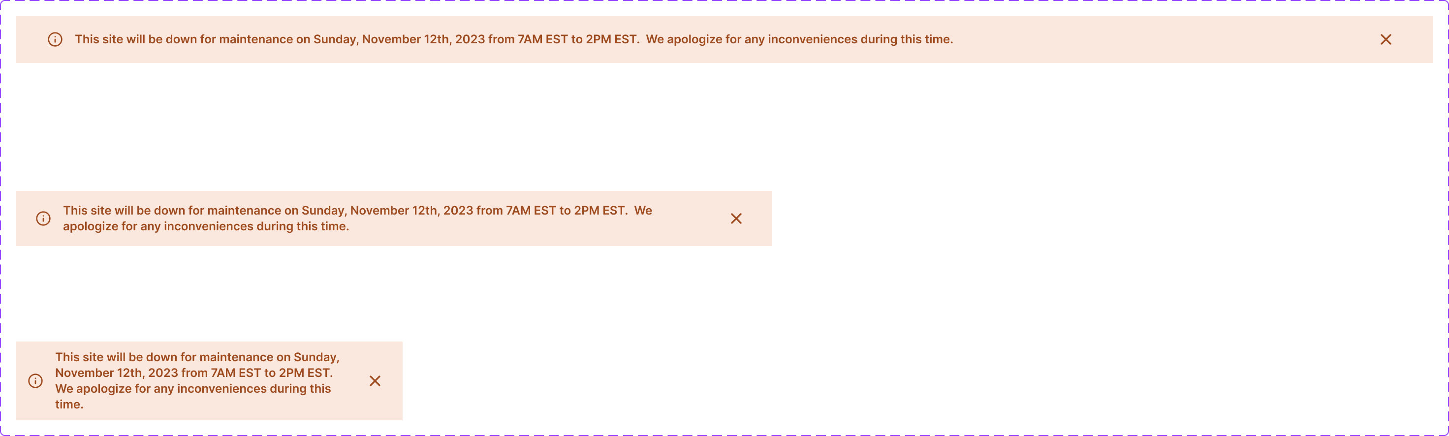
Figma variant properties: Breakpoint=Desktop/Mobile
Preview
Component preview image — to be added manually from Figma export.
Variants
| Variant |
|---|
| Desktop |
| Mobile |
| Dismissible / Persistent |
Props
| Property | Type | Default | Description |
|---|---|---|---|
message |
string | "" | Banner message text |
breakpoint |
"desktop" | "mobile" | "desktop" |
dismissible |
boolean | true | Show dismiss button |
variant |
"info" | "warning" | "critical" |
Usage
Do
- Use for time-sensitive system-wide information.
- Include an estimated resolution time when possible.
- Persist critical messages even if dismissed — restore on next page load.
Don't
- Don't use maintenance banners for marketing messages — use a separate component.
- Don't stack multiple maintenance banners.
Accessibility
role='alert'orrole='banner'.aria-live='assertive'for critical messages.- Dismiss button needs
aria-label='Dismiss notification'.
Tokens Used
color.semantic.Background.Attentioncolor.semantic.Background.Negativecolor.semantic.Content.Primarytypography.text.M.semiboldspacing.M